PayPal Case Study
Accessibility Capstone Project For School
By Graham Heldreth
My Roles
UX/UI Design Research Prototypes Wireframing
Content
Planning
The Problem
Research Insights
Design
The Takeaway
Tools
Figma
Figjam
Maze
Typeform
I needed to understand the problem. I researched accessibility practices, user knowledge, and the overall online payment market.
• Market Research
• Competitive Analysis
• User Interviews
I identified opportunities for improvement by examining user psychology and viability under the project’s scope.
• Affinity Map
• POV & HMW
• User Personas
Taking the research I uncovered key trends and user preferences, guiding the creation of a first iteration and minimum viable product.
• Design Patterns
• Idea Generation
• Wireframes
Moving from physical to digital, I created mid-fi into hi-fidelity screens. I developed useability test questions and interviewed users.
• Prototype
• Interview
• Interate
I moderated user testing scenarios, conducted five usability tests, and designed iterations based on feedback.
• Key Takeaways
• Moving Forward
• Final Thought
Planning
Innocently, My investigation began with the question, "How do we address accessibility issues on PayPal?"
It soon became apparent that the scope required focusing and the term “accessibility” demanded clarification. Astonishingly, preliminary research revealed that visual impairment affects over 200 million people worldwide.
With a growing interest in Accessibility standards, I sought to broaden my understanding of the diverse user base and unique business challenges. As a result, I crafted a project brief, developed a hypothesis, set constraints, and outlined the project objectives.
Problem
According to Nucleus Research, companies are missing out on a potential 6.9 billion dollars in annual revenue by not offering accessible websites, highlighting the urgent need for inclusive and accessible online payment solutions.
Shockingly, most payment companies have not addressed a full range of visual accessibility features. Here was my approach:
Market Research
An investigation into P2P and C2B payment volumes and markets was conducted, I identified the competition and learned valuable knowledge about accessibility standards.
Payments
A thorough examination of PayPal's current accessibility features was undertaken, leading to the identification of specific areas that required improvement.
Competition
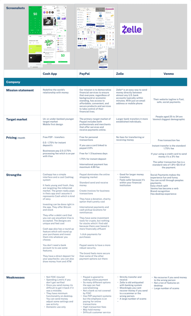
I did a full competitive analysis, looking for strengths, weaknesses, and current accessibility offerings.
User Interviews
Five user interviews were carried out, with the primary focus on payment pain points and participants' familiarity with accessibility standards or any challenges they encountered in that regard.
Competitive Analysis
Focusing on three main competitors: Zelle, Cash App, and Venmo.
A few high-level insights emerged:
• CashApp failed many contrast tests.
• Font sizing issues across platforms.
• Different platforms target different markets and are noticeable in UI.
My biggest takeaway from the competitive analysis was that none of the companies had comprehensive accessibility features focused on the visually impaired.
Challenge
One of the biggest challenges of this project was finding participants with first-hand experience with visual impairments.
To overcome this, I turned to users with family members who dealt with challenges seeing.
I also contacted an expert from a local association for the blind. Their insights proved invaluable in my research and helped me understand potential user challenges.
User Interviews
An initial screener survey was carried out to target users who had some familiarity with accessibility issues, which facilitated the vetting process.
Four key themes were the basis for constructing the interview questions.
Accessibility Challenges
Helped me understand the specific challenges that people with visual impairments face.
Mobile Vs. Desktop
Understanding users' preferences for payments helped to inform the design development.
Payment Frustrations
Insight into users' payment service preferences and what features or functions they find helpful or frustrating.
Assistive Technologies
Addressed the tools and technologies users rely on to enhance their online experience.


Define
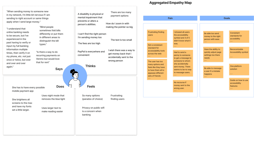
The affinity and empathy maps were consolidated to pinpoint pain points, focusing on users’ awareness of accessibility icons, features, and their engagement with assistive technology.
This approach proved valuable in creating informative personas that served as references and informed design choices throughout the project.
Affinity/Empathy Map
I utilized the affinity map to organize and group user feedback and insights, allowing patterns and themes to emerge. The empathy map allowed me to connect to the target users more deeply.
User Personas
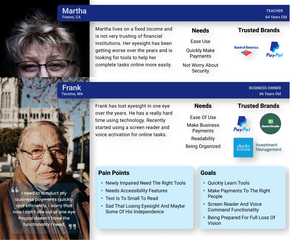
Overall, user personas are one tool for creating user-centered designs that meet the needs of specific user groups. I referenced them during my design process, but I believe they shouldn't be the only guiding factor.
Personas
Data from user interviews, affinity, and empathy mapping was synthesized, developing two distinct target user personas.
Research Insights
These approaches provided a holistic view of the market and user needs.
Ultimately, the research helped develop the product and design decisions with the target user in mind.
Here are the four main takeaways from my research.
Insight One
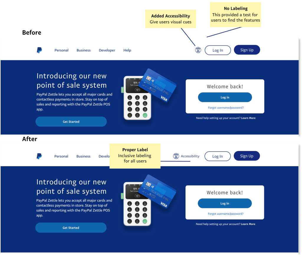
The accessibility icon isn't universally labeled. While most individuals with impairments recognize this symbol, what about the newly impaired or users that may need larger text?
Insight Three
Accessibility options are often not prominent or are a few clicks away on the website. This is counterintuitive to providing accessibility.
Insight two
By providing intuitive solutions, users know where to find key actions. This gives them confidence while making payments online.
Insight four
I looked at current market leaders' design patterns to gain insights. Reducing friction and the learning curve of our users' is often underestimated.
How Might We....
Create a seamless and accessible online payment experience for users with disabilities or impairments?
Ideate
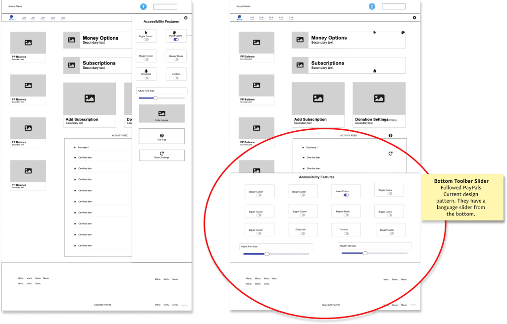
Various iterations of an accessibility toolbar slider, such as a sidebar design, were explored.
However, the final decision was to adopt a design consistent with PayPal’s existing language changer, which slides up from the bottom of the page.
Idea Generation
From pencil to paper, I brainstormed through mind mapping and lateral inspiration.
Low Fidelity
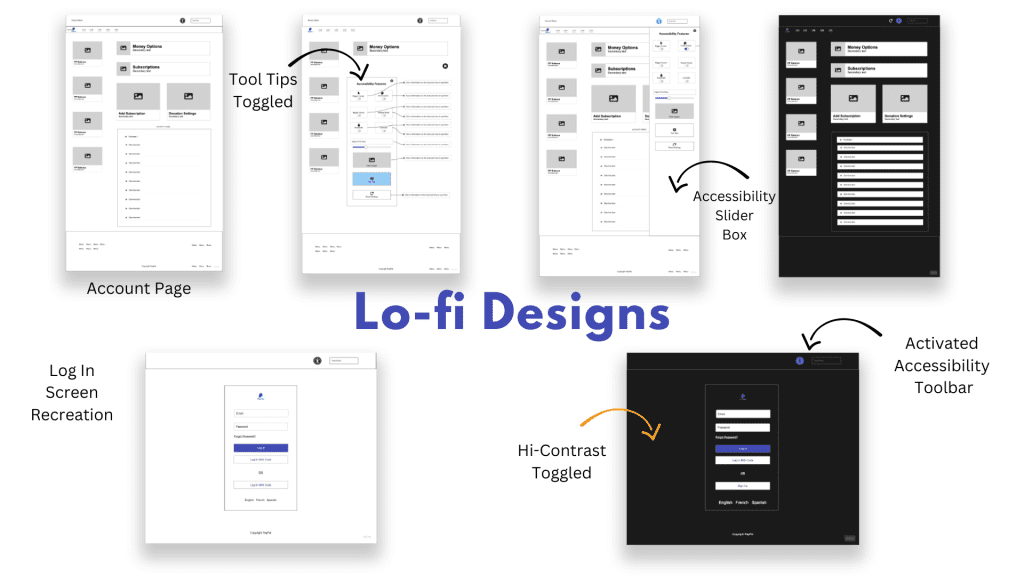
The design process started with low-fidelity sketches, eventually transitioning to digital wireframes. The desktop version of PayPal's home screen was recreated, and multiple iterations of an accessibility toolbar slider were developed
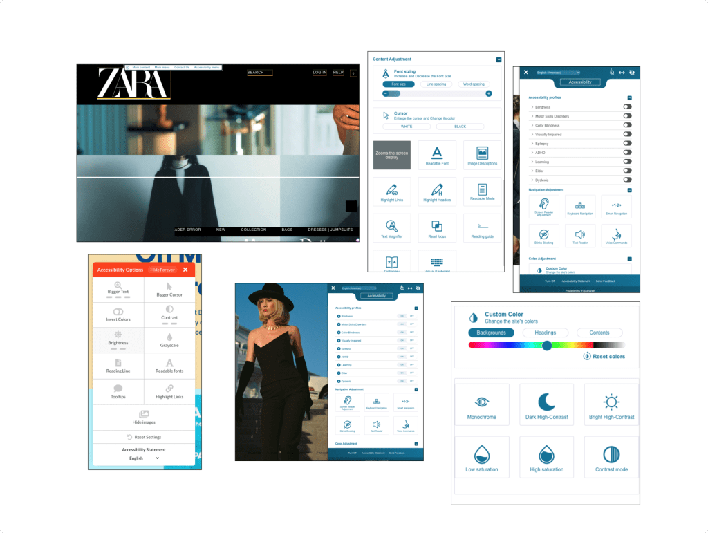
Design Patterns
I searched out and studied who was providing the most comprehensive accessibility features.
Design System
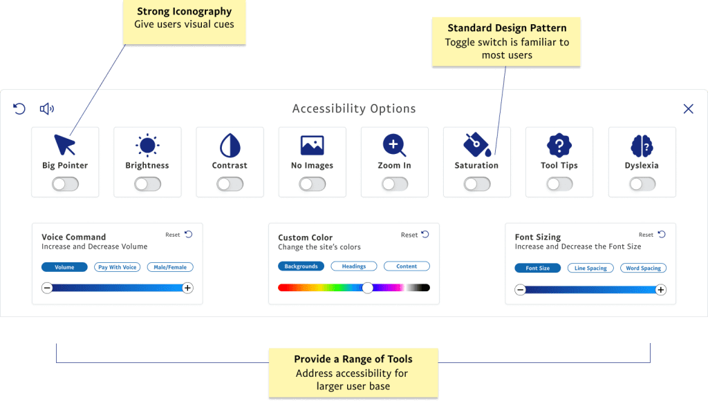
I developed a design and component library to utilize throughout my process. I tried to capture PayPal's current branding while making components more accessible.
I landed on a pattern that followed the current PayPal design. They allow users to switch languages by accessing a slide-up toolbar.
The toolbar slider is an entirely new feature; as such, I tried to stay within the PayPal framework of the design.
Prototype
Five usability tests were carried out, involving participants with minor vision impairments as well as non-disabled users.
Prototype
Polished all hi-fidelity designs and linked up prototypes for two task flows.
Consolidate Feedback
User feedback was compiled and analyzed, with feature implementation priorities established to adhere to the project timeline.
Usability Test
I conducted moderated tests via Zoom. Users were asked to complete two different task flows. I then conducted an interview gaining valuable feedback for my iterations.
Iterate
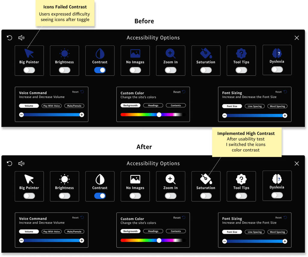
Based on the feedback and observations, I changed two main things. I properly labeled the accessibility icon and the toolbar icons' color for more contrast.
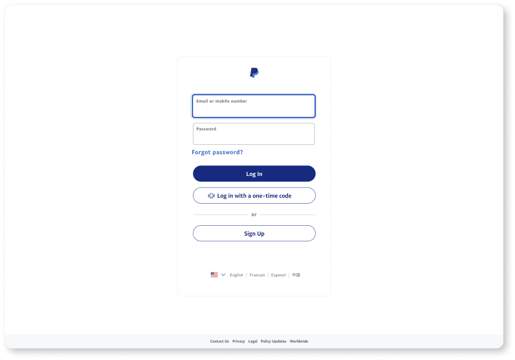
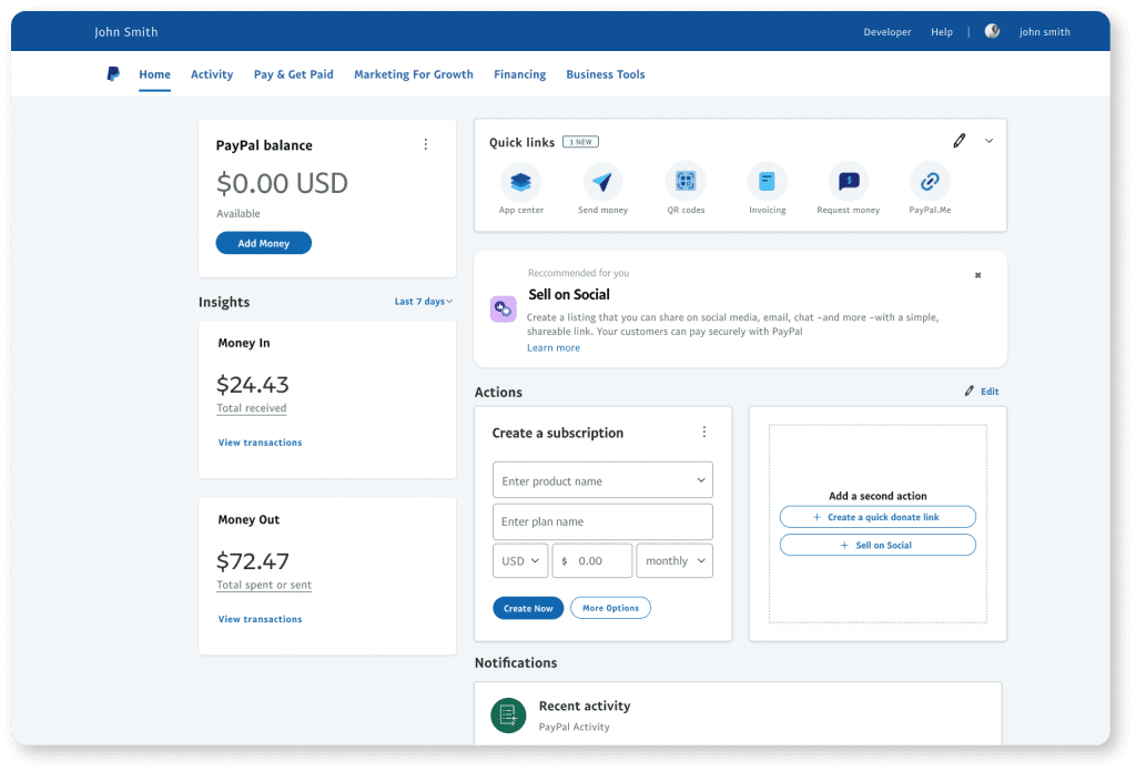
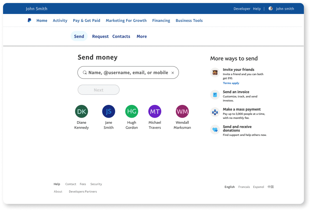
Recreated Site
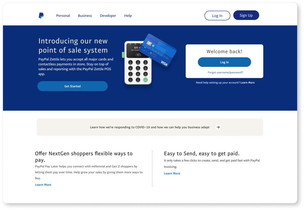
The PayPal design system isn’t publically available, so I recreated the site by eye, trying to get as pixel-perfect as possible.
Iteration
One
During testing, most users had never interacted with the accessibility symbol. They needed help finding the task feature, so proper labeling was iterated to reduce confusion.
Two
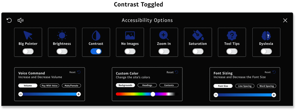
I failed to address the contrast of the icons after the feature was toggled. The color was switched to reflect high contrast standards in the second iteration.
Results
Currently, PaPal Is considered one of the most accessible sites on the web; however, the WCAG standards are imperfect and may fall short in some aspects. Specifically, addressing issues related to a wider range of disabilities would make the website more inclusive for users with these conditions.
It’s important to note that while the WCAG standards are a valuable resource for designing accessible websites, they should not be viewed as a complete solution to accessibility.
To truly create accessible and inclusive websites, designers and developers must also consider the needs of users with disabilities, test the product for usability and accessibility, and continually iterate and improve their design to ensure it meets the needs of all users.
In addition to being ethical, accessibility features can also benefit PayPal as a business.
Personal Thoughts
The discovery that most payment companies still overlook basic accessibility implementations was truly eye-opening.
Developing empathy for non-visual learners highlighted the significance of incorporating inclusivity in design, ensuring a comprehensive user experience. Focusing on inclusivity and accessibility is crucial for an enhanced user experience and offers a competitive business edge.
It became evident that testing and validating a product’s usability and accessibility is vital to the development process.
Selecting the appropriate users for such tests can be difficult, but ensuring that the final product caters to everyone’s needs is essential.
By prioritizing design and development with accessibility in mind, potential issues can be averted, resulting in a digital environment that is both accessible and inclusive for all.
Find something interesting?
Comments or Questions? Let's Connect!
All Rights Reserved 2023 © Graham Heldreth

